Exhibitions · 2026
Animated presentation on climate and agriculture for Roshydromet
Exhibitions / Animated presentation on climate and agriculture for Roshydromet
About the project
An animated presentation for Roshydromet: ten maps of Russia showing how the climate is changing for agriculture — from observations since 1976 to a forecast for 2060.
In summer 2026 we made an animated presentation for Roshydromet on the consequences of climate change for agriculture. It is based on the service’s scientific maps: how accumulated temperatures have been rising and moisture changing since 1976, how long the growing season will be in 2041–2060 and how much precipitation to expect in 2026–2035.
From these maps we put together a 4K video 2 minutes 20 seconds long: a single style, notes for each map and a final slide with conclusions for agriculture. The final version of the video was ready on 15 July 2026.
Year
2026
Industry
Exhibitions
Scope of work
Animated 4K presentation: 10 maps in 5 themes; the vertical video “From grain to bread”
- 10
- maps of Russia in five themes
- 2 min 20 s
- animated presentation in 4K
- 1976–2060
- from observations to forecast
The task
The source material was five Roshydromet slides with maps and legends. They had to be turned into a video: map after map, in one design, with notes and conclusions for agriculture. The deadline was 15 July 2026.
What we did
Presentation
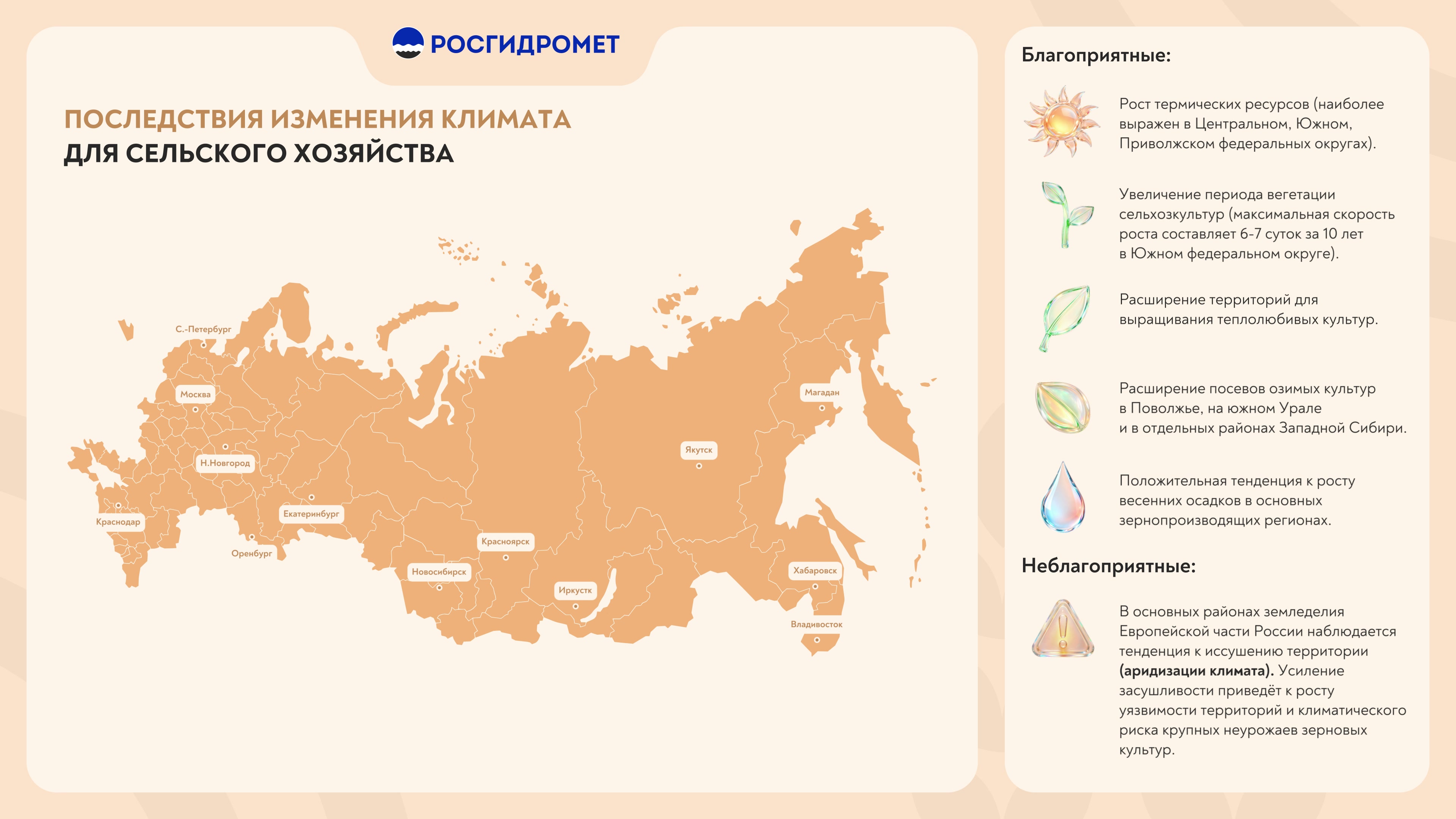
The presentation “Consequences of climate change for agriculture” opens with a blank map of Russia with thirteen cities — from St Petersburg and Krasnodar to Yakutsk, Magadan and Vladivostok — followed by five themes and ten maps. Next to each map is a column of three to five notes with icons: what the map shows, where the changes are strongest and what this means for the agro-industrial sector.
Besides the full version, there is a two-part version — 1 min 12 s and 1 min 28 s; each part begins and ends with the blank map.
Observations, 1976–2025
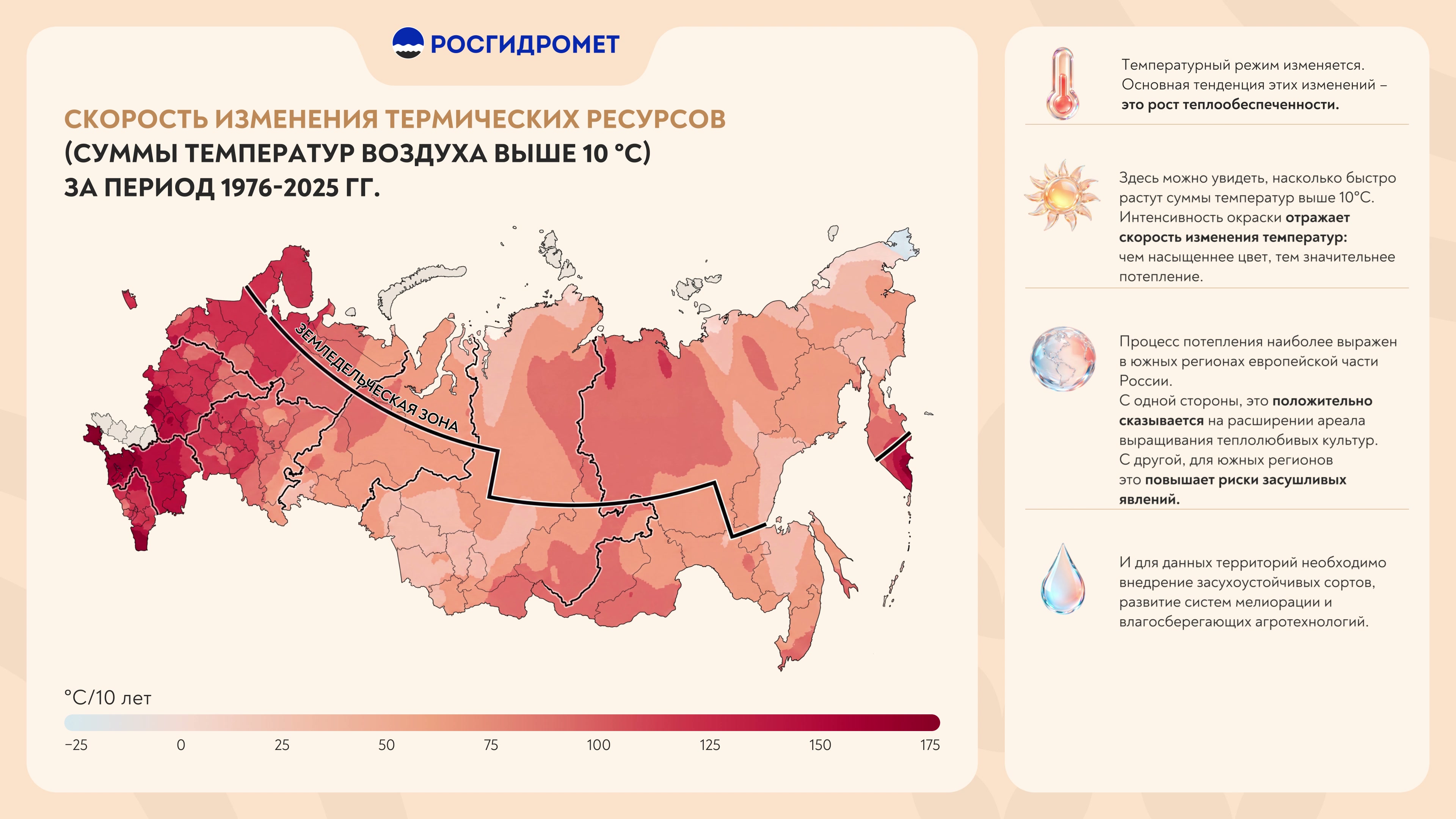
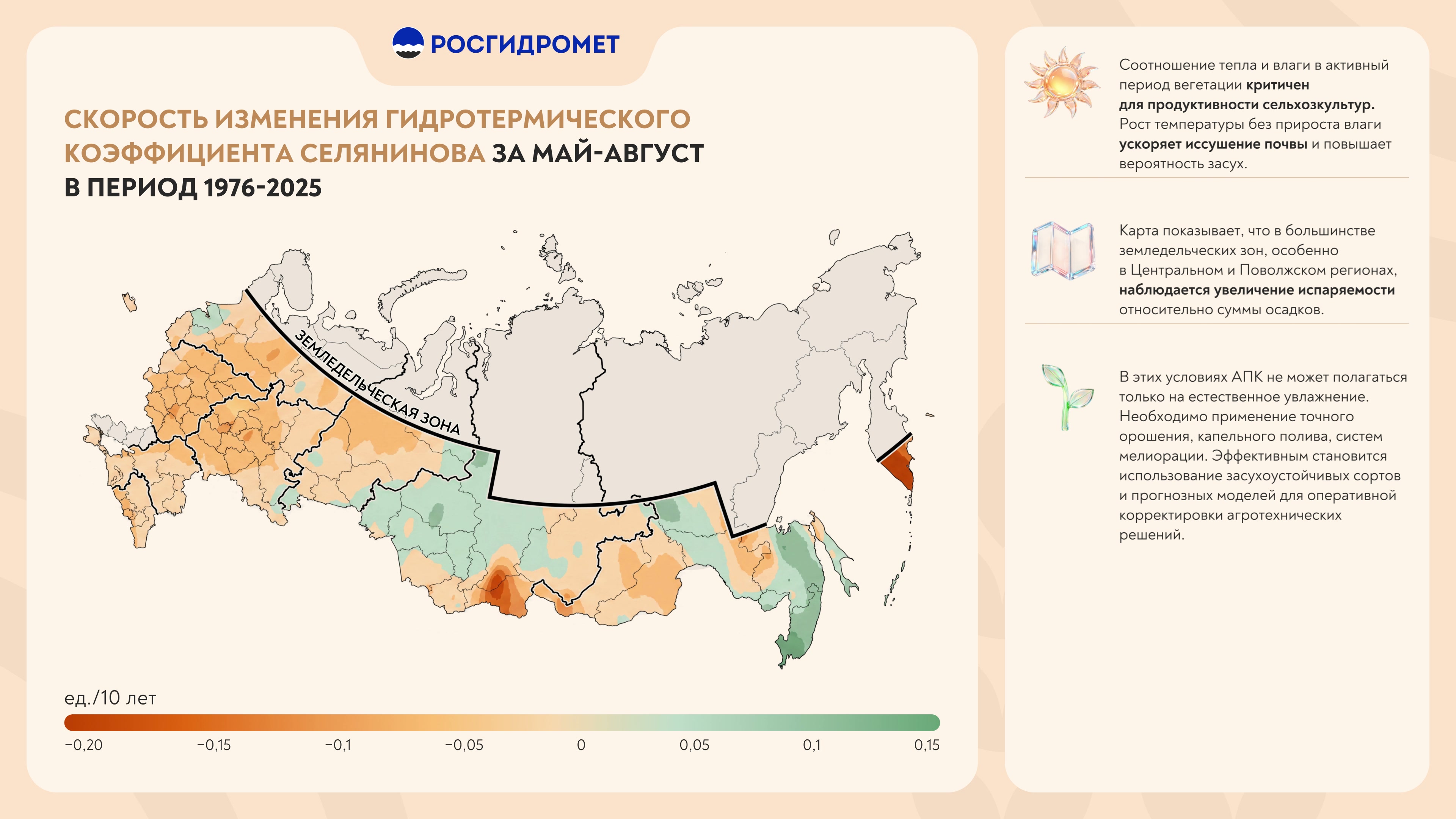
The rate of change of thermal resources — accumulated air temperatures above 10 °C for 1976–2025, with the boundary of the agricultural zone. The rate of change of the Selyaninov hydrothermal coefficient from May to August over the same years — the ratio of heat to moisture.
Forecast for 2041–2060
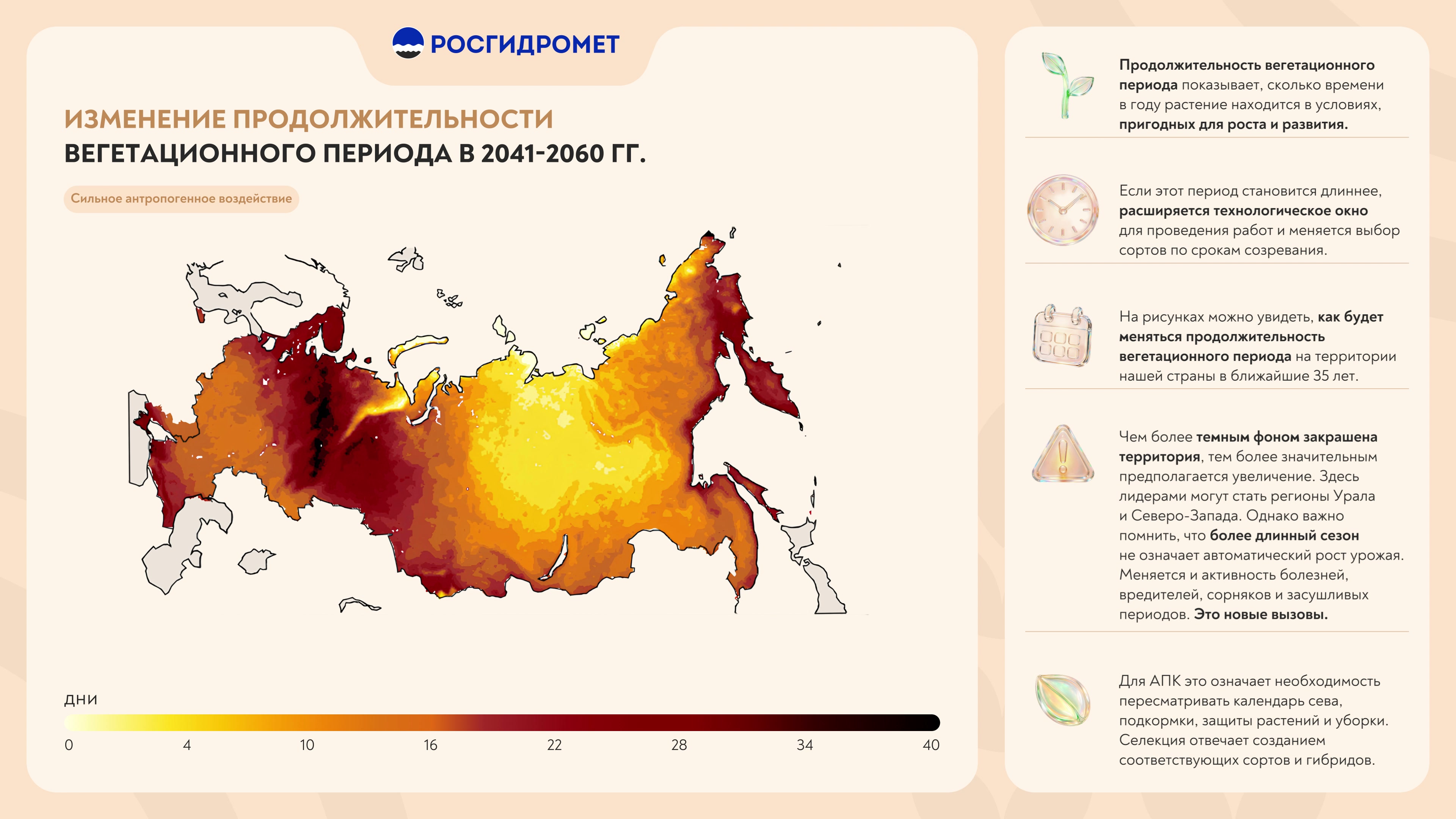
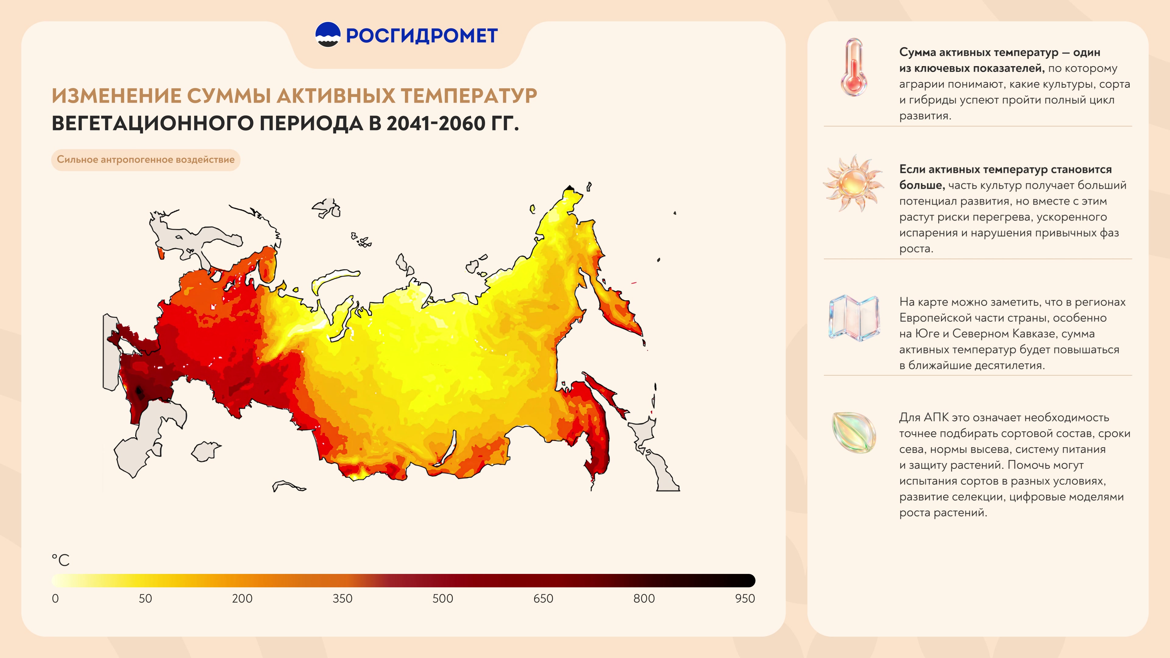
The change in growing season length and the change in the sum of active temperatures in 2041–2060 — two maps each: under moderate and under strong anthropogenic forcing.
Precipitation in 2026–2035
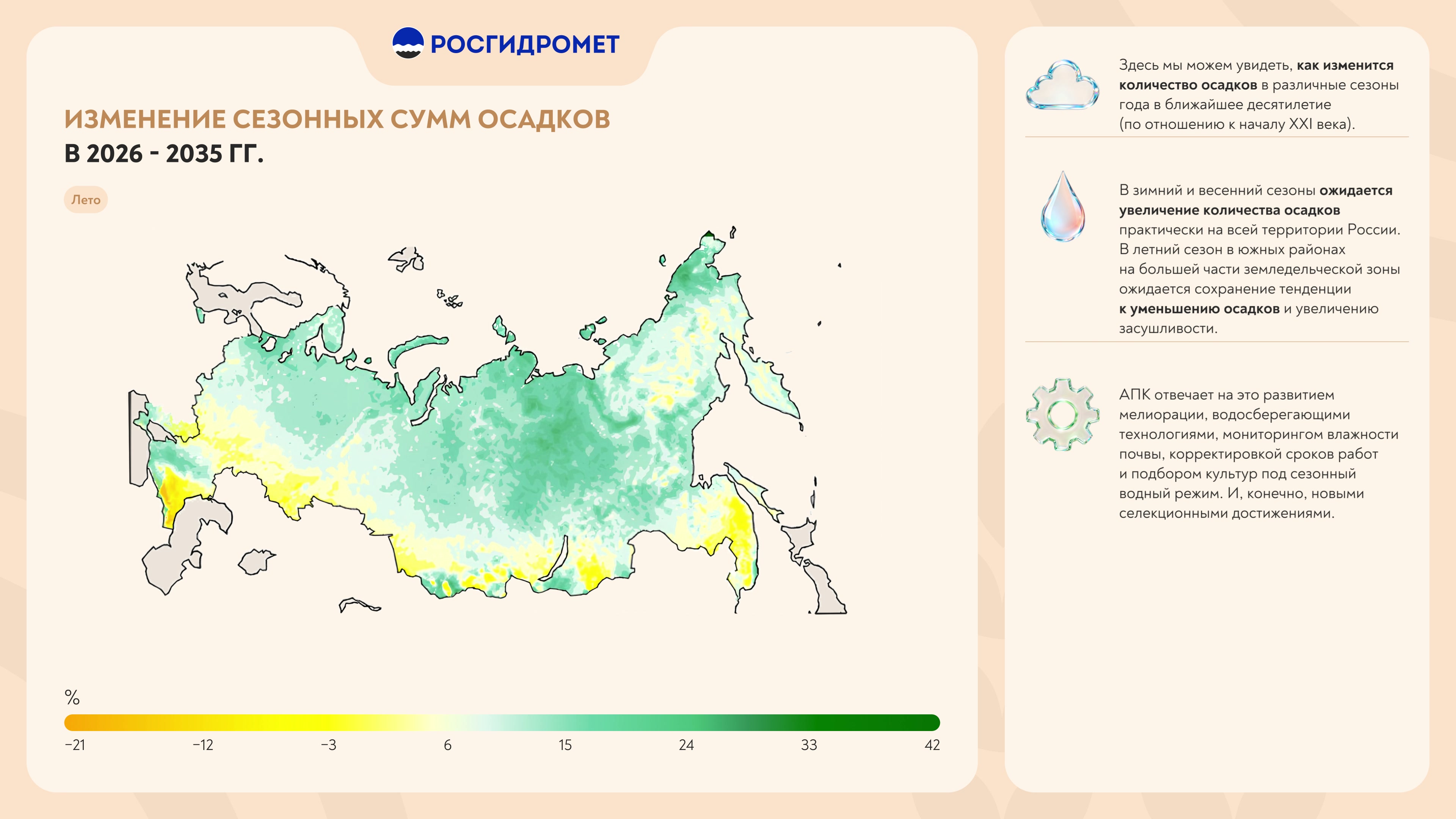
The change in seasonal precipitation totals in 2026–2035 — four maps: winter, spring, summer and autumn.
Final slide
“Consequences of climate change for agriculture” — five favourable consequences: growing thermal resources, a longer growing season (by up to 6–7 days per 10 years in the Southern Federal District), more land suitable for heat-loving crops, larger areas under winter crops and more spring precipitation. And one unfavourable one — the drying of the main farming regions of European Russia.
“From grain to bread” video
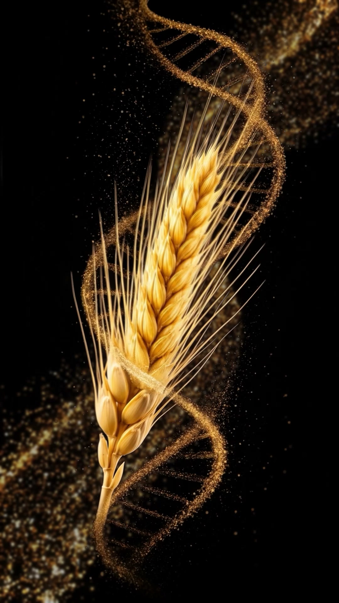
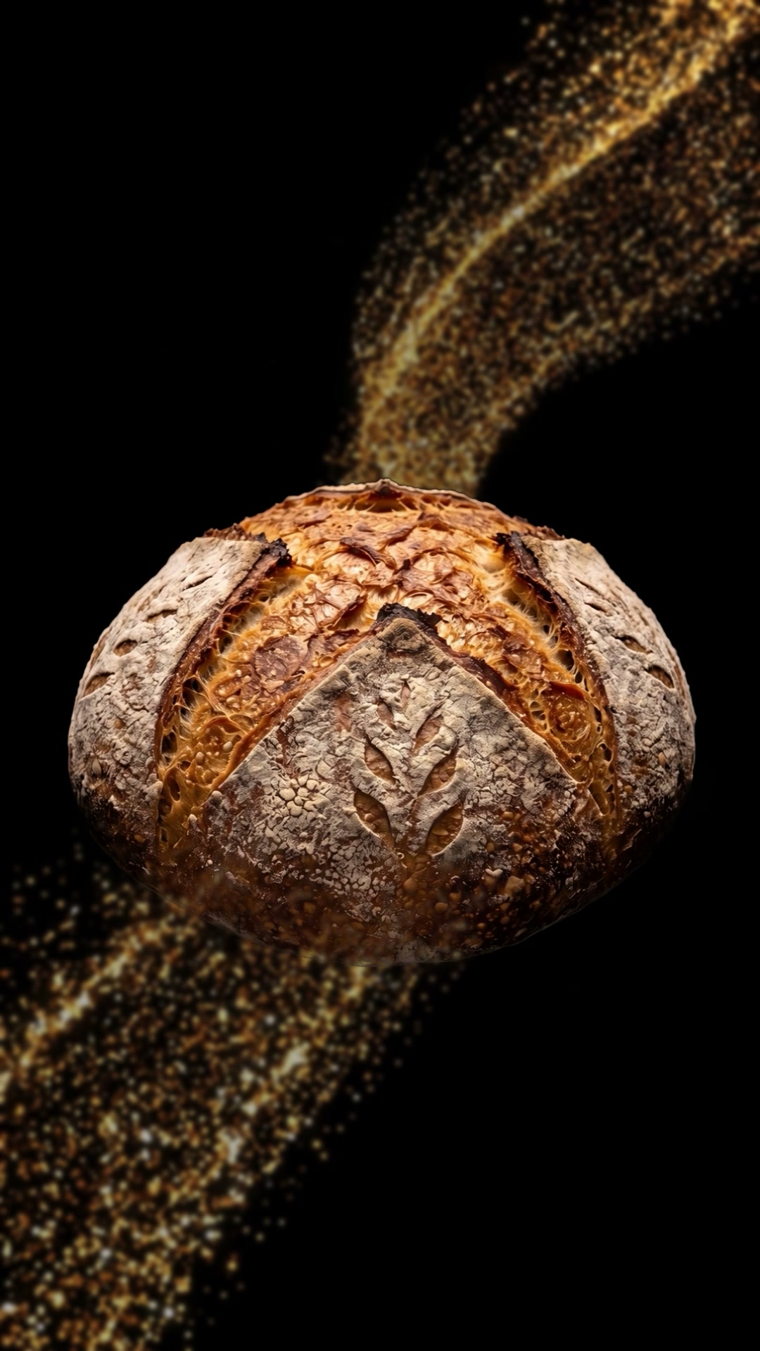
A 50-second vertical video, 1080×1920: a grain of wheat sprouts, an ear rises in a golden DNA spiral, then come flour, dough, bread — and grain again. Style frames were made for five crops: wheat, sunflower, maize, soya and sugar beet — from seed to processed products.
How it is built
The video is 3840×2160 at 30 frames per second. The screen is split in two: on the left, the map with a heading, a scenario or season label and a colour scale; on the right, a column of notes. Above the map is the Roshydromet logo, and the background is light beige.
Each map gives way to the next in a wave of colour, and the notes appear one by one.
The maps themselves are Roshydromet data: we styled them consistently and animated them. Before the style was chosen, we prepared four interface options and five colours for the base map.
Result
By 15 July 2026 the full version of the presentation (2 min 20 s, 4K) and the two-part version were ready, as well as the vertical video “From grain to bread”.
Similar projects
-
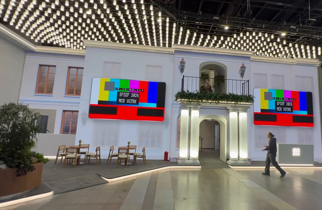 Software for the DOM.RF stand screens at SPIEF 2026
/2026 — Exhibitions
Software for the DOM.RF stand screens at SPIEF 2026
/2026 — Exhibitions
-
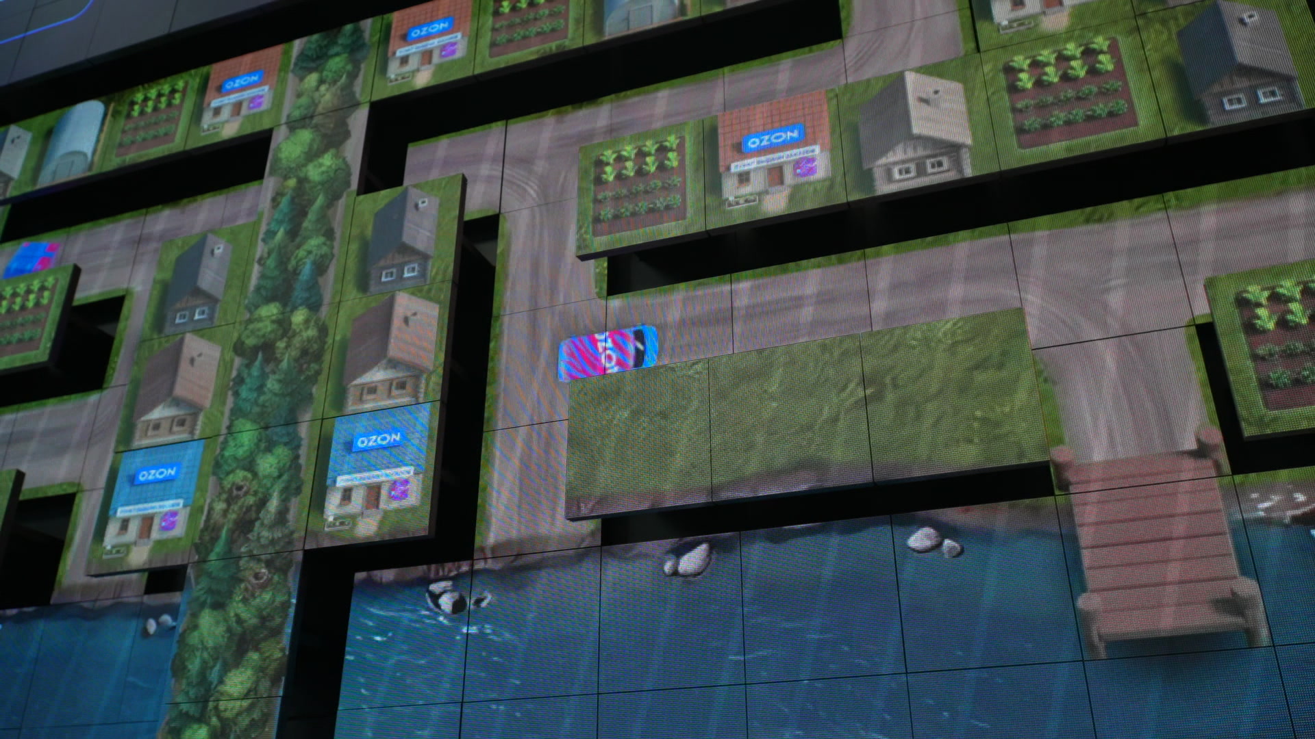 Kinetic screen game for the Ozon stand at SPIEF 2026
/2026 — Exhibitions
Kinetic screen game for the Ozon stand at SPIEF 2026
/2026 — Exhibitions
-
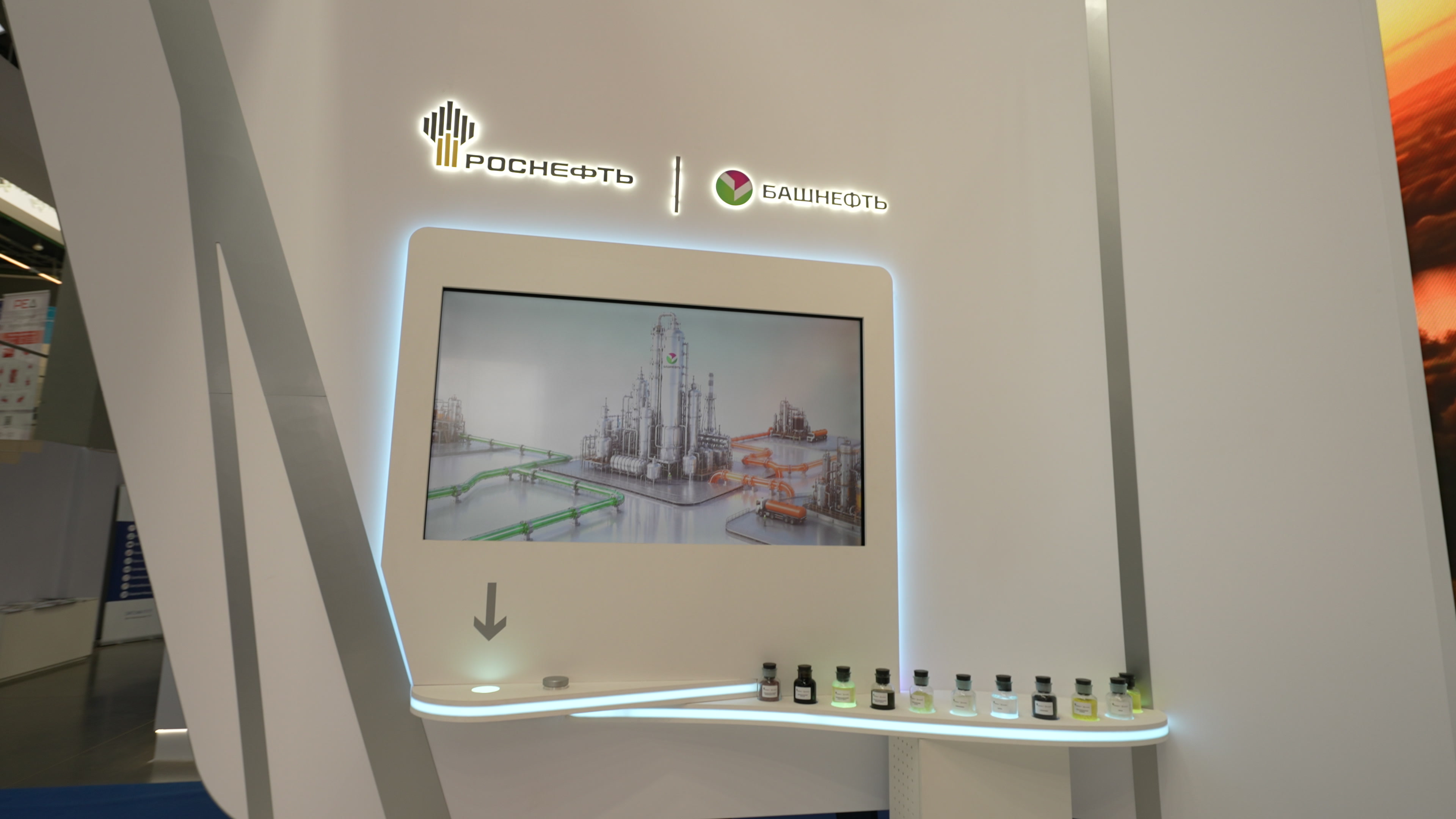 Interactive zone of the Bashneft stand at “Gas. Oil. Technologies — 2026”
/2026 — Exhibitions
Interactive zone of the Bashneft stand at “Gas. Oil. Technologies — 2026”
/2026 — Exhibitions
-
 Content for the screens of the ICS Holding stand at CIPR-2026
/2026 — Exhibitions
Content for the screens of the ICS Holding stand at CIPR-2026
/2026 — Exhibitions